I have been away blogging for a couple of years, maybe out of sheer laziness or lack of interest. Time to come out of that and start irritating the blogworld one post at a time.
I have been away blogging for a couple of years, maybe out of sheer laziness or lack of interest. Time to come out of that and start irritating the blogworld one post at a time.
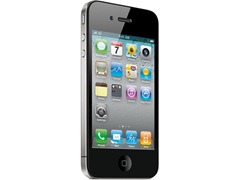
I have been using iPhone for a year now and had the opportunity to compare it alongside with my other phone which is an Android. I know I am going to offend a lot of Apple fans but I am going to say it as it is. Maybe my viewpoints are from a geek’s perspective and iPhone is more suited for a regular user.

Seen iOS keyboard? IT’S ALWAYS IN UPPERCASE. No I don't mean
I know someone loves the concept of a single button but human mind doesn't work like a single button. While reading a message if I come across a web link and I click it, expectedly, it opens Safari and opens the page. After reading the page, unexpectedly, I cannot go back to the message I was reading.
Why oh why do I have to press the Home button, scroll thru my apps, click on the message app again and open the message again, and this is suppose to be user friendly? Oh, don't tell me about double click the home and choose the app from the running apps… just give me a back button (ok, I know you cant give me more than one button, so just give me swipe gesture on the notification bar to go back).
I know that different applications have different features and therefore need for different UI, but even in similar apps (message, mail, phone log) there is no consistency of UI.
Consider this:
In phone log (recent), you can clear all record, you can delete one entry at a time (which wasn't possible until iOS5) but you cannot select multiple entries and delete them at one go.
In messages (SMS), you cannot clear all messages, you can delete one at a time but you cannot select multiple entries and delete them at one go. However, if you open a message trail, you can clear all at a go, select multiple entries and delete them or (of course) delete a single message if you like.
In mail you cannot delete all mail but you can select multiple mails and delete them.
In contact, there is no way to select multiple, or for that matter single contact, and delete. You have to open the contact, tap edit, scroll down before selecting delete contact.
Why can’t we have “Delete all”, “Delete Selected” and “Delete Single” consistently across all apps?
The edit button too is not consistent in its placement. In phone (recent) it appears on the right, in messages (SMS) it appears on the left, in mail it appears on the right.
| App | Edit | Del all | Del Multiple | Del Single |
| Phone (Recent) | Right | Yes | No | Yes |
| Message (List) | Left | No | Yes | Yes |
| Message (Thread) | Right | Yes | Yes | Yes |
| Right | No | Yes | Yes |

Hey, You don’t have to agree with me but don’t expect me to agree with you either
I have been a gadget freak since as long as I remember. I was 
When Smartphones arrived I was the happiest, as I could let go of one device and yet be connected to the net.

The next wave I caught was Blackberry.. Got myself a Curve and

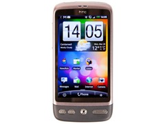
The Android revolution – I was hooked. I got myself an HTC Desire

Having used almost all Smartphones in the market, I began to realize the good features of each of them and started dreaming of mixing the features into a single phone – my dream phone. Like that is going to happen So, I am doing the next best thing – Listing out what should go into my dream Smartphone here and hoping that some of the mobile companies might read this post and evaluate if my suggestions (and DEMANDS) are valid and they may incorporate it in their next version.
So here goes….
Don’t force me to use two hands on a mobile phone
I believe that phones should be a one-handed device which I can glance at and operate while I am having tea or reading a book or even typing with one hand on my laptop. If I have to use both hands I will use a laptop, thank you.

Don't make me switch on just to see if there are notifications
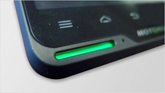
Why oh why so many phone manufactures don't put a notification LED anymore? (That includes iPhone, Samsung series, Nokia Lumia). Is it not fashionable anymore? Guys, I hate it when I have 
Don't make me hunt all over the place for notifications

Don't make me run apps just to see quick information
That's soo un-smartphone, to show just a list of apps (Nokia did this with its DumbPhones oops.. feature phones too). When I switch on my phone, I don't want to see a list of my apps.. I want to see information (and not just how many unread SMS). I want to be able to quickly glance and see whose SMS are pending, who has mailed me (at least the subject line?), what's the weather like and how posted recently on FB. All this without having to open apps or slip and slide all over the place. Windows Mobile had this as “Today Screen” and Android took it to the next level by allowing “Widgets” to be places anywhere on the screen.
Thanks to this, most of the time I am not even running apps but just glancing over the info and deciding if I need to take an action. iPhone has continued with the old-fashioned idiom of showing screenful of apps. Windows Phone did go in the right direction with tiles but unfortunately due to limited size of the tile, its difficult to show meaningful information (most tiles still show count badge – 2 unread mails or 3 unread SMS, instead of showing me names of people who have mailed/messaged me and subject line/preview of message).
Don't make me do tuk tuk on a tiny keyboard with fingernails
Mobile typing has always been a pain since the original cell phone. Earlier it used to be alpha-numeric keypad with multiple press of a button to get the 2nd or 3rd character. A mail would take forever to type on it. Windows Mobile came up with an onscreen keyboard which, while it was an improvement, it still was cumbersome to type with a stylus. iPhone supposedly “revolutionized” mobile typing. Well, it did not. All it did was make the screen a big bigger, keyboard a bit more spaced out and lost the stylus so that we could type with our tiny(?) little fingers. I don't know about you guys but I have fat fingers which press 3-4 keys at a time. I find myself resorting to using tip of my fingers carefully to press one key at a time. Sometime sharpening my fingernails to click that tinnnny URL on a webpage.
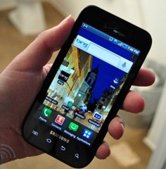
The real revolution happened in mobile keyboard was with Swype. I just love it! I don't have to be accurate, I don't have to go tuk-tuk on a tiny keyboard… I soo wish that iPhone and WP include a Swype like keyboard in their next version (as they don't allow 3rd party to integrate keyboards). This is one thing I just cant live without on my mobile and which is probably why Android is my primary device (You can download Swype for any Android phone and many phones come built it in with Swype (Samsung) or Swype-like keyboard (Sony Xperia).
Don't miss the 1+ billion market


Electronics and water are arch enemies
There are at least 3 phones I ruined by either dropping into water or due to sweat seeping into the phones. I mean, its a known fact that electronics don't “gel” with water. How difficult is it to make the phone waterproof? Swiss and Japanese did this with watches long ago, so I am sure they can learn from watch makers. Its not that it hasn't been done. I remember a Nokia feature phone which is totally water proof and more recently Sony too, so why cant all Smartphones do this?
Smartphone have dumb batteries
I agree, as the capabilities of smartphone increase, the need for higher capacity battery will also go up. I am not asking for battery to last for months or even a week, but c'mon.. you cant provide a battery which can last even for 24 hours if I am using Wi-Fi, GPRS or watching videos?
I am out in the sun, can I charge it please?
That brings me to the next point.. Ok, so you cannot provide enough battery power to last me 24 hours but why cant you provide me with a built in solar panel (maybe the back cover?) or a reasonably priced external solar charger to charge my phone in emergency situations.
If I discharged my battery watching videos without realizing, at least give me someway to charge it a bit and make that emergency call?
Stop concealing things and making them pricey
I loved those times when everything was open and replaceable I could get an SD card of my choice and insert it or maybe get extra batteries which I would charge and keep as backups before taking off on a long journey. Apple came in a ruined everything. Now batteries are concealed and the manufacture provides different “capacity” phones with exorbitant differential pricing?? Guys, we know the difference between 16GB and 32GB SD card is not that much. Stop trying to fleece us.
What? I cant stop jerks from calling me?

All in all while Smartphones have made rapid strides in many areas, they still lack a lot of basic things. I hope people making these phones read this post and decide to do something about them.
What do you think of your Smartphone's features? Are there any features you just LOVE or just HATE? Post your thoughts in the comments.