Pages

August 27, 2010

Taskbar Magic

Share on Facebook


images

Windows 7 introduced “Superbar” which is like a Taskbar on steroids. What strikes you immediately is that Taskbar buttons are the right size for touch operations, which of course is built into Windows 7. However, there are many cool features like Jumplists, Aero Peek, Combining of Taskbar buttons and desktop peek. I am sure if you are using Windows 7, you must have discovered this by now so I am not going to talk about it. I am going to talk about certain apps which are taking advantage of the new Taskbar capabilities. In TechED 2010 I presented a session on WindowsAPICodePack and how to program the Taskbar button using C++/COM or .NET code but don't worry, I am not going to show programming code here Smile. We are beginning to see new apps using the Taskbar very innovatively. Lets look at some of these applications.

Taskbar Meters

image

Traditionally we have had applications which show us system information in system tray (Task Manager) and Desktop (Sidebar) but this cool little utility called Taskbar Meters put it right on the Taskbar. It actually uses a feature meant for showing progress bar on the Taskbar button. You must have seen this in Windows 7 when you run Setup, the progress is indicated on the Taskbar itself so that you can minimize the window and yet keep getting visual feedback of the progress. Well, this utility sets the progress value to current CPU, RAM and Disk utilization. Real Neat.

Here is a screenshot of all 3 meters

image

If it takes too much space on your Taskbar, use Combine option to make them more like thumbnails or run only the one you want to keep an eye on (e.g. CPU).

Gmail Notifier Plus

image

Gmail Notifier Plus is another cool application which act as a notifier from the Taskbar itself. As shown in the image, the Taskbar button shows the Gmail icon with unread count and right click bring up the “JumpList”. It makes very innovative use of JumpList by providing a set of user actions like “Compose mail”, “Go to your inbox”, “Check for new mail” and “Change settings”. But along with it, it also provides a list of unread mail in the Jumplist itself. The pin feature doesn't work so you cannot Pin a mail to the list and I don't know if it will make sense to pin a mail to jumplist.

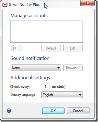
When you install this app, it starts off with a configuration window which allows you to add multiple Gmail IDs (including Google App domains id). It uses a pull mechanism instead of push, so you have to specify the frequency for checking for new mails. The interface is simple and clean.

SNAGHTML394d7ab

But what takes the cake is the Aero Peek feature of this app. The preview window displays first few lines of your mail with an icon to open the mail in your default browser to read.  and also provide back and next button to view your unread mail.

Gmail

All in all its a cool utility if you use Gmail.

Taskbar Stacks

Mac OSX introduced a concept of stack on its dock which is like a “spring up” list of apps, recently opened doc etc. Windows developers were not far behind in implementing this feature on Windows 7. There are 2 stacks which provide similar functionality – 7Stacks and Standalone Stack.

While both are equally good, I found the UI of 7stacks a bit more pleasing.

7Stacks

image

Windows 7 allows you to pin programs on your Taskbar thereby merging erstwhile Quicklaunch features into Taskbar. However, if you use a lot of applications, your Taskbar can fill up very quickly with these pinned programs. I regularly use different browsers to test web sites and therefore have at least 6 browsers in my list. If I pin all of them (apart from MS office apps), my Taskbar will be half full (or half empty). 7Stacks allows me to take any folder and convert it into a popup stack (as shown in the image), there by occupying only one button space on the Taskbar but allowing me to quickly access a group of applications with 2-clicks. Once launched, these apps behave normally and appear on the Taskbar.

When you install 7stacks, it creates a desktop shortcut for creating a stack. All you need is a folder which will be made into a pop up stack and icon to represent the stack on the Taskbar.

image

As you can see in the image above, you can select virtually any folder and convert it into a stack. It gives you a quick access button SF for Standard Folders like My Documents, My Videos but also like Control Panel, Start Menu, Program Files etc. Once you choose a folder, specify an icon to represent it, choose the stack style (Vertical, Grid or Menu).

image

Once you click on “Create Shortcut on Desktop”, it will generate you stack shortcut, simply drag and drop it on the Taskbar and you are done.

image

The above image shows a stack in Grid layout with an option to explore the folder in regular Windows Explorer.

Check out Standalone Stack and decide which of these two (or both) you want to use.

Conclusions

Taskbar has some great features and while applications like these are making innovative use of those features, we are likely to see many more developers take advantage of Taskbar in future.

Have you come across such utilities which make innovative use of Taskbar? I would love to know about it, so drop me a comment.

Happy Tasking Smile

August 26, 2010

Why haven’t I used IE in months?

Share on Facebook


icon_ie7

I think I was conducting a training on “Windows programming using C” in a company called VeriFone Bangalore when I first saw Internet Explorer. Like Netscape, it had a logo on top right which would rotate as the page was loading. I was fascinated with the UI and thrilled that I could look up information so easily and quickly. On the other hand there was Netscape, a powerful browser which was the de-facto standard. I think Netscape was $50 while Microsoft started giving away its browser free with the operating system which led to a massive law suit and Browser wars. The browser war was good in a way because it made both companies bring host of innovation and rapid changes eventually helping the customers. Its another thing that Netscape lost the war and IE became the de-facto standard on the web. I was siding with IE thru the war as I found it to be a better browser than Netscape.

Phoenix rises from the ashes of Netscape

120px-Mozilla_Phoenix_Logo

As Netscape lost the battle and made the source code open, the code base gave rise to another project called Phoenix (rising from the ashes of Netscape). Phoenix was however already a registered name so the team tried to rename it to Firebird, which too turned out to be registered so they finally called it Firefox. I have been using Firefox since Phoenix days but did not pay too much attention as it could not match the capabilities and features of IE. But I did keep an eye on the browser as it matured. Then one day it happened… I discovered add-ons and extension which allowed me to customize, configure and personalize the browser the way I wanted. Also, the new JS engine made its way into Firefox, speeding it way beyond IE performance.

Missing IE?

ffx_ie7When people don’t like or use a software, they tend to remove or uninstall it. However, IE is one software which remains on every Windows installation that it there. Why? Because you never know when you will need it. There are hundreds of site which work with IE but not Firefox. This may not be intentional but due to the fact that IE did not enforce strict adherence to HTML and web standard while Firefox always did. So a missing closing tag would still render in IE whereas it would refuse to show up in Firefox. Imagine you test your web site in IE and a day before you go live, out of curiosity you open in it Firefox and you are horrified as the page is a mess. Can’t imagine? Ask Chandrasekhar “Netscape” Vyas who earned this moniker precisely for this reason Smile

Stop switching between FF and IE

If you use Firefox regularly but have to switch to IE because of certain sites, now you can get IE Tab Plus. What this Firefox add-on does is it loads IE in one of the tabs in Firefox. I am not talking about emulating IE, I am talking about loading the IE engine in the tab so that you can open all those IE specific sites in Firefox without having to even launch IE. Go ahead and download IE Tab Plus from Firefox Add-ons site and lets roll.

image

Once you install IE Tab Plus, you will see and icon in the system tray. This icon toggles between FF and IE.

Lets get to work

The number of sites which work only with IE is reducing fast but there are still some sites which either refuse to work with anything other than IE or don't work well with non IE browser. Lets take a look at such sample site.

SNAGHTML70c4df5

This site flatly refuses to work with Firefox. It clearly says “Sorry, this site requires Microsoft Internet Explorer 5.5 or later.” Now lets switch the site to IE by clicking the FF icon in status bar.


image There are variety of ways in which you can switch the engine from Firefox to IE. The easiest way is to click in icon. Another way is to right click the page which brings up Firefox context menu which allows you to switch rendering engine. If you right click on the icon, it brings up a menu (as shown in the image). You can take a call if you want to switch the engine in the same tab or launch the page in IE.


image

Here is a screenshot of the same site, still running in Firefox but being rendered using IE engine. As this is not simulated (browser-agent switching), you get real experience of IE. As you can see in the screenshot, if you right click on the page, you get IE context menu and not FF. To switch back, simply click on the icon back. If you require full IE interface, you are welcome to use “View Link in Internet Explorer” which will launch IE and not use FF tab.

Configuration

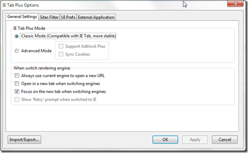
You can configure IE Tab Plus to share cookies with FF or even allow AdBlock Plus. You can also decide in-tab switching or opening a new tab. It also allows a site filter where you can specify sites which will always open in IE (at one point of time windowsupdate was the most gruelling IE-only site).

SNAGHTML6452136

Conclusion

So now you know why I haven't used IE in months Smile

Happy switching Smile

August 25, 2010

Growl for Windows

Share on Facebook


images

Every OSX user eventually comes across Growl as either it gets downloaded along with some app or stumbles upon documentation which talks about Growl. In fact, some OSX users tend to believe that it ships with OSX itself. I have been using Growl since my MacMini days and when I got my 17” MacBook Pro, it was one of the first apps that I downloaded on my OSX partition.

What is Growl?

In very simple terms, Growl is centralized notification system which receives notifications from apps and displays them in a consistent, configurable manner so that every app does not have to build its own notification mechanism. You can use Growl to decide which notifications to show, how to show them and what action to take if the user interact with these notifications.

Growl for Windows

logoI was pleasantly surprised to stumble upon Growl for Windows which neatly mimics the functionality and features of Growl for Mac. While OS X version has support of many applications, Windows apps do not come with built-in support for Growl yet.

General


Apps and Displays

Most applications build their own notification systems from scratch. Think of Live Messenger popup toaster, Outlook’s new mail alert, System alert for low battery and so on. Then there are web based apps like Gmail, Facebook etc. which have their own notifications which are either delivered when you go online on the site or via email. Some may even have custom built alert apps just to notify you. Growl can unify all these and provide a consistent user experience.

Gmail GrowlApps can be applications which have built in support for Growl or a helper app in from of a plugin, extension or add-on which detects changes and relays the notification to Growl. The list of such apps is increasing steadily and cover a range from web based apps like Gmail, Twitter, Facebook to desktop apps like Outlook, Skype, Visual Studio to even hardware automation like ECS & ZWave automation systems.

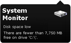
System Monitor NotificationDisplays are notification UI and notification styles which can be configured and customized. Display is a misnomer because apart from the typical notification toaster window and sound, you can even configure it to send SMS, email, post to twitter account or run an application.

Forwarding and Subscriptions

Imagine that you are an administrator managing a dozen of systems in an office. Instead of checking and verifying  every system periodically for regular maintenance issue, you install Growl on each one of them and forward their notifications to your administrative system. So if someone has low disk issue, you can remotely run disk cleaner.

In addition to forwarding, you can subscribe to notification from other system including web site to be informed of events occurring on those systems.

Phones, SMS and Email

toprowl_confirmGrowl supports forwarding notifications to iPhone thru plugins in Prowl, Howl and you can also forward notifications to an email which makes it ideal for being able to keep track of events while on the move. If you can also send notifications to your system thru email and other means, coupled with triggers, you can launch commands and control your system remotely.

Conclusion

Growl is a nice move in the direction of unifying notifications on Windows on the lines of Growl of Mac and we should soon see a lot more native support built into applications in future. Meanwhile try and get a helper application for the popular applications and website and enjoy!

Happy Growling Smile

August 23, 2010

UI Candy or Visual Feedback?

Share on Facebook


fissionI am a software junkie and try out lots and lots of software and utilities to see what works for me. It gives me a chance to discover new software which help make my life easy. I alternate between multiple browsers like Internet Explorer, Firefox, Opera, Chrome and Safari. My main browser currently is Firefox while I use IE and Chrome for testing my blog and ASP.NET apps I tinker with. One feature that I really liked about Safari is that its progress bar which is displayed as part of the address bar itself.

Visual Feedback

Wait, its not a UI candy thing but a very sensible feature. When we type a URL, our eyes are looking at the AddressBar and after hitting ENTER they do not automatically shift to the status bar to see the progress bar. In fact, they continue to gaze at the AddressBar and waiting for the page to load. So what Safari has done is put the feedback about the progress right in front of our eyes.

image

Here is a screenshot of Safari loading a page with visual indication of the progress.

Fission

Meet Fission, a Firefox add-on which not only mimics Safari in displaying progress bar inside AddressBar but goes one step further showing “Connection Status” of  Waiting, Connecting, Transferring too.

image

Check out the image above (click on it to enlarge if you like) and you can see that a yellow bar is indicating overall progress while on the right side of the AddressBar shows the current stage of “Connected”.

Needless to say, you can configure the colour of the progress bar and decide if you want to see connection status on the right side of the AddressBar or not.

SNAGHTML1d6df02

The last option is interesting one too… When you move the mouse over links in a page, it does not obstruct your view by popping up the link url as a tooltip, rather, quietly changes the URL in the AddressBar temporarily.

Conclusion

Sometimes, User Experience is not about nice images and smooth fonts but about understand how users interact and providing visual feedback in the most natural way like Fission does.

Happy Browsing Smile

August 22, 2010

Don’t read it now, ReadItLater

Share on Facebook


Information Overload

imagesHave you noticed that the pace of life is increasing and we are always short of time? Our commutes are getting longer and information overload doesn't help either. Look at the sources of information we have in todays time – Newspaper, Television, Telephones, Car-radio, Messenger, Facebook, LinkedIn, Email, RSS Feeds, Stumble Upon and the list goes on. Wait, add my neighbour who is like BBC broadcast about the going-ons in my building.

Unutilized time

imagesImagine this scenario, you are getting ready to leave for work in the morning and checking your mail while sipping tea and you notice a great article someone sent you in mail. You want to read it but don’t have the time, so you keep the mail in the inbox and rush out to catch your bus and train. You are going to spend next 30-90 mins commuting but you aren't reading what you wanted to.

Better utilize you time

imagesNow re-imagine the same scenario differently.. you open the mail, notice the link which is of interest. When it opens in your web browser, you simply click “Read it later” and it syncs the article to your iPhone, Blackberry, Android, PalmPre, WinMo etc. Once you are in your bus, you take out your phone and start reading the article you saved. You don't even have to be online on GPRS if the Wi-Fi sync at home transferred the entire article on your phone. After reading, the article is automatically marked “Read”. When you reach office, you start your browser and the browser shows you a list of articles still not read.

ReadItLater

api

ReadItLater is an add-on available for Firefox and other browsers (IE, Chrome, Safari) and also supported on SmartPhones (iPhone, Blackberry, Android, Windows Mobile, Palm Pre, Nokia N60). Once you install ReadItLater and create a free account, login from your browser. It adds an icon to your Toolbar and AddressBar. If you come across an article that you would like to read but don't have time at that moment, just click the icon in the AddressBar and it will sync the entire page into your reading list. This list can then be synchronized to your phone and even other browsers. If you turn of offline viewing, it can download web view or text view and keep it locally so that you can use it while using laptop in flight or on phone while travelling on a bus/train.

image

Reading It Later

Having marked all your articles, you can click on the ReadItLater button anytime to pop up a list of articles, choose one and it opens it in a tab (even if you are offline). Once you are thru reading, it can either automatically mark it as read or you can configure it to wait for you to manually mark it as read. You can configure multiple locations and multiple browsers so sync your links across.

image

Imagine this.. You are at home and logged into Firefox and mark a set of sites in ReadItLater. Now when you reach office, you login to ReadItLater using IE or Chrome and you will see the same list available to you there. Mark them as read and when you come back home, the reading list is automatically synchronized.

Google Reader Integration

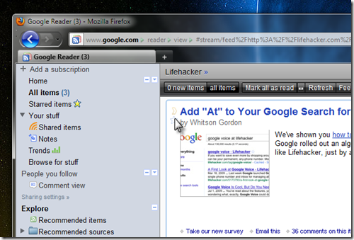
There are many website we stumble upon while surfing but a lot of them could come from RSS Feeds. I use GoogleReader to keep track of things of my interest and ReadItLater integrates beautifully with GoogleReader too.

image

You can see from the image above that ReadItLater puts its faint yellow caret sign at the beginning of feed title which you can click to transfer that particular item into the reading list rather than the entire page.

Conclusion

Use ReadItLater to schedule and utilize your time better so that you have more time available for important thing. If you can configure you home pc browser, smart phone and office pc browser, you will not miss out on important article and keep track of things.

Happy Reading Smile